Wednesday, May 15, 2013

Movin' (er, building) On Up.....

One of my favorite aspects of my job is creating long lasting relationships with clients, and being a part of the many transformations that can occur to their home over time.

About six years ago, I met the "Dickens" clients, and helped to completely remodel their one story home. We gutted Bathrooms as well as their Kitchen and made many changes to other parts of the interior as well as the exterior of the home. We were all very pleased with the outcome (phase one can be seen on my website.)

Now, six years later my clients decided that instead of moving from the home that we so beautifully remodeled, they would add a second story to house a new master suite. The second story is just recently completed. Here a snapshots I took to document the project (professional photos coming soon).

The construction begins...


materials for new Master Bathroom are selected.....

Framing of the new Master Bedroom-pitched ceiling and staircase


Fast Forward! Drywalled, and doors and staircase are in.


Beautiful ceiling detail

New stairs with finished balustrades and handrail

New Master Bathroom begins....

(shower and vanity walls)


Let's just skip to the good stuff....
(completed shower)


Vanity underway.....


And completed.....


As with any project, there are still finishing touches to be completed. When I walked through the addition today with my clients, I was so excited by how everything looked. I know I sound like a broken record, but it is amazing to be part of a project and see your ideas and designs come to fruition. It is an even bigger pleasure to have such wonderful clients who allow you to do so.


Saturday, January 12, 2013

The Transformation...Continued.


I know I sound like a broken record, but seeing and being a part of design transformations keeps me energized and loving what I do. One of my current projects right now is the "remodel" of what was a Mediterranean inspired house to a more transitional/traditional one. This meant making some architectural changes, as well as adding fantastic details like casings around bull nosed arches, paneling and wainscoting. You can see some of the progress pictures in an earlier blog post. Here are some updates...fresh from the job site.

Family Room: I wanted to straighten the curved wall and make the fireplace wall a more important feature of the room. The client and I share a passion for paneling, and added paneling above the fireplace as well as a new surround. We will be using statuary marble around the firebox. We also decided to add crown molding to the existing entertainment unit, paint it white, as well as add some custom details like decorative moldings.


The Family Room as it looked before we began.

Goodbye curved wall..

Already looking better. If you look closely, you can see the mock up of the paneling that I had the carpenter draw on the wall so the client could get a feeling of the scale of it.

Just primed .....such an improvement.

Powder Room: This is the formal Powder Room of the house, and was lacking any special details. My client showed me a picture she had been holding on to when we first started the job of a bathroom with beautiful paneling. More paneling? Yes, please!


Paneling just installed, prior to be primed and painted. My client and I walked into the Powder Room the day it was installed and were giddy with excitement.

The main staircase of the house had this somewhat curly iron design. Below is the "before".

Just installed-our new wood balustrades. The handrail and treads to be stained like the floors and the posts and balustrades to be painted white.


More to come, we are nearing the finish line!


Thursday, December 13, 2012

My Time In Wonderland

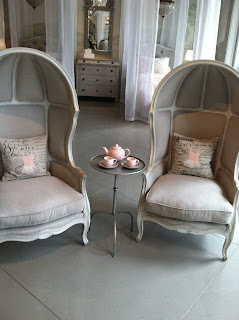
I recently visited the Restoration Hardware Baby and Child store in Santa Monica. Perhaps I shouldn't just call it a store. For me, it was like stepping into a fantasy land. Each vignette more drool worthy than the next.

I say fantasy for several reasons. First, it all looked like candy that I wanted to touch. Second, what kid can live in such a pristine environment? I mean, the "tea set" in the front of the store was ceramic and very breakable. But, who needs reality? I walked around the store gasping at all of the ideas....antique mirrored walls behind the cribs...tufted headboards on tiny beds....pint size benches .

Take a look.


All of these ideas provide inspiration and would be very easy to re-create, albeit with more kid friendly materials. There's that reality creeping in again...

Friday, November 16, 2012

Transformation

One of the most exciting aspects of what I do is seeing the transformation of a house. Witnessing and being a part of ideas implemented and seeing them come to fruition is what keeps me energized and what renews my love for Interior Design on a daily basis.

I am currently working with clients that purchased a beautiful home, it just wasn't their personal style. It was really lacking a specific style but was swaying in a Mediterranean direction. My client wanted a clean, crisp, transitional feel. Like me, this client loves all things panelled. We agreed that panelling should be added wherever possible as there were high ceilings and arches all over the house. There were many changes that had to be made to transform the house from the "wishy-wash" style it was to the look we are trying to achieve.

We are still in the midst of construction, however major changes are underway. Below are some examples of the transformation .....


The Dining Room: probably my favorite of the rooms being transformed because we are adding so many architectural details. Wainscot is going up, as are the casings in the entry to the room. We also changed the color of all of the walls to a taupe gray. The panelling will be white.


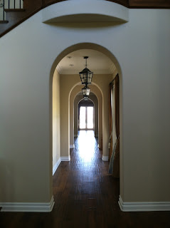
Arches in gallery are getting panelled casings


The Family Room: The fireplace was on a curved wall that didn't make sense in the room, and I thought the lack of mantel/surround made it seem less important.I wanted this to be the focal point in the room. We are straightening out the wall, adding a wood mantel/surround and panelling the entire fireplace wall.The entertainment center is also getting larger moldings added to it and being lacquered white.


The Living Room: The inset carpetting is being replaced with wood.


The Kitchen: Demo, demo, and more demo. All countertops and backsplashes have been demolished.We are having the cabinets lacquered white, as well as replacing the cabinets to the left and right of the hood  with glass inserts in the doors. We are replacing the countertops with white statuary marble and a white subway tile on the backsplash. The shape of the island countertop is going to be made rectangular and we are adding furniture legs to it.


I will update with more transormation pictures. Wait until you see the finished product!

Friday, October 5, 2012

What a Difference Art Can Make

I have been working on my "Collingwood" project for well over a year.

Because my client does not live here full time, finishing the house has not been a top priority for her. We started over a year ago with the "basics". Furnishings but no accessories, art or any other finishing touches that can really make a house look like a home. Although all of the pieces we chose were beautiful and rooms were technically complete, the lack of those details really made it feel empty.

Several months ago, I got the green light to finally finish the job. I was so excited because it can be disappointing to have the concept in your head regarding what the finished product will look like but not be able to bring that vision to fruition.

Where to start? Well, art. The house has high ceilings, and the bare walls made it feel cold. I contacted a local art rep that I have worked with in the past because while the art budget did not allow for all pieces to be noteworthy I wanted the client to have some artwork that was original. I mixed those originals in with "filler" art. I truly believe it's all about how you present something...you can mix the expensive with the more affordable pieces and they all can co-exist together.

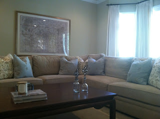
I commissioned an artist to paint a a triptych in silver leaf on panels for the long wall in the Living Room, and also found a collection of 18th Century botanicals for the Dining Room. For the Family Room, I found an over sized framed map of Paris for my Francophile client from a large (mass produced) art company.

While I am still putting the finishing touches on the house, having artwork on the walls has drastically changed the overall feeling of the home. It feels so much warmer and welcoming.

Living Room before art:

and after....


Dining Room before art


and after....


Family Room before art

and after.....