Thursday, December 13, 2012

My Time In Wonderland

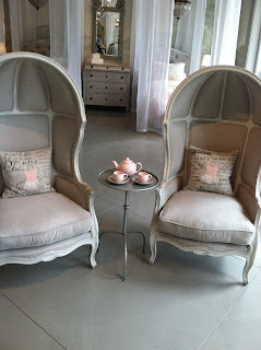
I recently visited the Restoration Hardware Baby and Child store in Santa Monica. Perhaps I shouldn't just call it a store. For me, it was like stepping into a fantasy land. Each vignette more drool worthy than the next.

I say fantasy for several reasons. First, it all looked like candy that I wanted to touch. Second, what kid can live in such a pristine environment? I mean, the "tea set" in the front of the store was ceramic and very breakable. But, who needs reality? I walked around the store gasping at all of the ideas....antique mirrored walls behind the cribs...tufted headboards on tiny beds....pint size benches .

Take a look.


All of these ideas provide inspiration and would be very easy to re-create, albeit with more kid friendly materials. There's that reality creeping in again...

Friday, November 16, 2012

Transformation

One of the most exciting aspects of what I do is seeing the transformation of a house. Witnessing and being a part of ideas implemented and seeing them come to fruition is what keeps me energized and what renews my love for Interior Design on a daily basis.

I am currently working with clients that purchased a beautiful home, it just wasn't their personal style. It was really lacking a specific style but was swaying in a Mediterranean direction. My client wanted a clean, crisp, transitional feel. Like me, this client loves all things panelled. We agreed that panelling should be added wherever possible as there were high ceilings and arches all over the house. There were many changes that had to be made to transform the house from the "wishy-wash" style it was to the look we are trying to achieve.

We are still in the midst of construction, however major changes are underway. Below are some examples of the transformation .....


The Dining Room: probably my favorite of the rooms being transformed because we are adding so many architectural details. Wainscot is going up, as are the casings in the entry to the room. We also changed the color of all of the walls to a taupe gray. The panelling will be white.


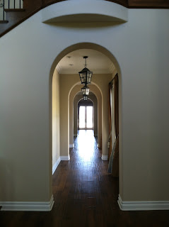
Arches in gallery are getting panelled casings


The Family Room: The fireplace was on a curved wall that didn't make sense in the room, and I thought the lack of mantel/surround made it seem less important.I wanted this to be the focal point in the room. We are straightening out the wall, adding a wood mantel/surround and panelling the entire fireplace wall.The entertainment center is also getting larger moldings added to it and being lacquered white.


The Living Room: The inset carpetting is being replaced with wood.


The Kitchen: Demo, demo, and more demo. All countertops and backsplashes have been demolished.We are having the cabinets lacquered white, as well as replacing the cabinets to the left and right of the hood  with glass inserts in the doors. We are replacing the countertops with white statuary marble and a white subway tile on the backsplash. The shape of the island countertop is going to be made rectangular and we are adding furniture legs to it.


I will update with more transormation pictures. Wait until you see the finished product!

Friday, October 5, 2012

What a Difference Art Can Make

I have been working on my "Collingwood" project for well over a year.

Because my client does not live here full time, finishing the house has not been a top priority for her. We started over a year ago with the "basics". Furnishings but no accessories, art or any other finishing touches that can really make a house look like a home. Although all of the pieces we chose were beautiful and rooms were technically complete, the lack of those details really made it feel empty.

Several months ago, I got the green light to finally finish the job. I was so excited because it can be disappointing to have the concept in your head regarding what the finished product will look like but not be able to bring that vision to fruition.

Where to start? Well, art. The house has high ceilings, and the bare walls made it feel cold. I contacted a local art rep that I have worked with in the past because while the art budget did not allow for all pieces to be noteworthy I wanted the client to have some artwork that was original. I mixed those originals in with "filler" art. I truly believe it's all about how you present something...you can mix the expensive with the more affordable pieces and they all can co-exist together.

I commissioned an artist to paint a a triptych in silver leaf on panels for the long wall in the Living Room, and also found a collection of 18th Century botanicals for the Dining Room. For the Family Room, I found an over sized framed map of Paris for my Francophile client from a large (mass produced) art company.

While I am still putting the finishing touches on the house, having artwork on the walls has drastically changed the overall feeling of the home. It feels so much warmer and welcoming.

Living Room before art:

and after....


Dining Room before art


and after....


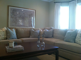
Family Room before art

and after.....


Sunday, September 2, 2012

Treasure Hunt

I love antiquing. Not in the fancy, neat and carefully laid out kinds of places but instead in the ones where you really have to look to find the treasures. My heart starts to race when I start the hunt. It's really exciting when I am working on a job in which I can scavenge for, and collect for the client. When I saw that there would be an antique fair just minutes from my house, I couldn't contain myself. While I have been a few times now, this time was especially heart palpitation inducing, as I am in the middle of accessorizing a job in which the client loves found objects. Perfect, an excuse to go!


It can be overwhelming because I always want to make sure I see absolutely everything. I have become good at scanning the booths to surmise whether I should stop and sort through their wares, or keep on moving....

so many treasures...so little time.


My finds of the day! Two Edwardian cut glass canisters and an antique mirrored tray for my client. I don't know where I will use them yet, perhaps a canister on a stack on books on the Living Room coffee table...or, both on the Entry table....I have so much more to collect for this client.

Just another reason I love what I do.

Tuesday, August 7, 2012

Ode to Victoria

There were signs early in my life that I was destined to be an Interior Designer. First, there was the remodel and wallpapering of my dollhouse. Doesn't everyone do that? Then, there was the love for Victoria Hagan and all that she does. I remember following her work before I had realized my career path and talking about her with people not emersed in all things Interior Design, that looked at me wondering who I was talking about, and why. If I had to pick one designer that is an inspiration to me, and whose work I adore the most it would be Victoria Hagan.

 I often see installations that she has done in design publications and while I always admire her work,  it was the article I found on Architectural Digest.com (http://www.architecturaldigest.com/decor/2012-08/victoria-hagan-connecticut-coast-house-article) that featured her own home that got my heart racing. Seeing her personal style and choices made for her own home was inspiring  It's these kinds of images that make me excited to do what I do and reminds me why I love Interior Design.

Where to begin.....the layering, the fantastic pattern on an otherwise traditional wing chair, the subtle colors....


Layered, but not cluttered. Clean and simple....


Cool tones, comfortable pieces, "clean traditional"..


Timeless, elegant and understated, just like her designs.
http://www.victoriahagan.com/

Monday, July 9, 2012

My Happy Place ( well, one of them...)

Paso Robles is my happy place. Well, maybe number one on my short list. There are so many reasons I love to spend time there; from the amazing wineries and restaurants to the scenery. Every view looks like a California landscape painting. I just spent a few days there and wanted to share a few snapshots.

I came across ( and completely fell in love with) this house at the end of a long country road. After standing there for a few minutes and fantasizing about leaving the hustle and bustle of LA and moving into it, I mapped out what I would use the sun rooms for. A girl can dream.


I enjoy collecting artwork from local Paso artists, and my favorite is Sue Johnson.(http://data.fineartstudioonline.com/dataviewer.asp?keyvalue=7356&page=Works) Her paintings remind me of the rolling hills studded with grape vines, and the charming red barns that you see around every turn.


Above are two recent acquisitions. Looking at them makes me happy as it reminds me of Paso Robles.

More beautiful views....


                      Booker Vineyard                


Jack Creek Cellars


I visit as often as I can. It takes less than three hours to get there so until I can make it permanent, I will happily sit back and enjoy the ride.


Tuesday, June 19, 2012

Start To Finish

For a year, I have been working on a private residence in Becket, Mass. It has been a treat to head East and spend time in the beautiful Berkshires, even if during my first trip I experienced the first snow of the season and had inappropriate footwear. My clients were so willing to allow me to take the reins and lead them.
The home is a Timberpeg (http://timberpeg.com/about) design, which means most of the walls are exposed tongue and groove, as well as many of the ceilings. All of these details make the homes very warm and rustic.


During my first visit, the framing was underway however many of the design decisions had to be made. First stop was a kitchen showroom.I knew exactly what I wanted and the clients loved the idea. Below are some progression photos, from conception to completion:


materials

progress


completion


I was involved with every aspect of the design, from the hardwood flooring to the selection of the interior and exterior stacked stone. Below are some progress pictures of the construction:


 Last week, I flew back East to install the furniture, below are a few snapshots of several of the pieces used:


 I love the challenge of designing something unlike anything I have done before. There are still some finishing touches we are working on; accessories, rugs etc. but I am so pleased with the outcome.